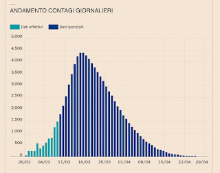
March 23: good news and bad news
Some
tentative "good" news and some ... not so good. A few posts ago I
showed a graph of a model of the daily new cases predicted in Italy.
The graph shows new cases beginning to decrease on Mar 18. It was then
revised to March 23. The model is shown again here with the actual data,
that tracks it pretty well. If this holds up it means two important
things: 1) they are finally on their way to "flattening the curve" (the
graph needs to get down to 0, and 2) the assumptions about
the main modes of spread of the virus are correct, and the "stay home"
and closure measures (enacted about 3 weeks ago) are working. What's not
so good? Look at the third graph. It shows the number of cases as
they increased in different countries. South Korea (brown) was ready
with testing and strong immediate containment measures. Italy (red
graph) obviously screwed up somewhere (in spite of what I saw as quick
strong measures... but that's another story). US is grey. You can try
your own guess as to where this is going.


Comments
Post a Comment