April 6: Which "curve" are we talking about?
I am not surprised that folks are confused about the apparent
contradiction between "light at the end of the tunnel" and "the worst
weeks are still to come", and even Dr. Fauci (with all due respect) did
not do a good job explaining that... This goes together with them
talking alternatively about "peaks" and about "flattening the curve".
The explanation will be totally obvious to folks who have had
calculus... but I will assume that that knowledge might be rusty for
many at this point. What's been unclear
(IMO) is that they have been talking about two different curves, and
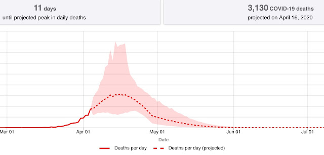
they have not bothered to explain that fact. The first curve (first
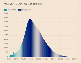
picture) shows the daily number of deaths in the US. I have been showing
the daily number of new cases. The shape is the same. So, what happens
is that deaths (or new cases) keep increasing as the virus takes off.
If measures are effective the daily number of new cases (and, later,
deaths) will stop increasing. When that happens, we have reached the
PEAK of curve one ... The "light at the end of the tunnel"! Assuming
that that holds up (and it could stay there, as a "plateau" for a while
as Cuomo has mentioned). It's good news because it shows that the virus
has been slowed down. But, wait, even if we go to the other side of the
curve, deaths keep happening, for a whole month according to figure 1
until, ideally, we have no new cases and, eventually, no new deaths.
Let's now look at curve #2. That's for the TOTAL number of deaths! The
point where curve #1 reaches the peak is the middle of the rising part
of curve #2, so deaths will continue to increase until curve #1 goes to
0. At that point curve #2 has finally been "FLATTENED". So the claim
being made is that they "see" the increase of deaths slowing down, at
least in some area (so we may getting close to the PEAK), while at the
same time we are in the middle of the rising part of curve #2 so deaths
will continue .... Oh, well, I tried... For those who remember their
calculus, curve one is simply the derivative of curve 2. Real data of
course will look much more "messy"!


Comments
Post a Comment